When we talk about creating a supportive space for someone living with dementia, colour probably isn't the first thing that springs to mind. Yet, choosing the right colours can be one of the most powerful and simple ways to improve safety, maintain dignity, and boost a person's overall well-being. As dementia progresses, it changes how the brain understands the world, and that includes what the eyes see.
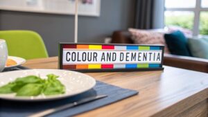
The Hidden Link Between Colour and Dementia

The link between colour and dementia isn't just about making a room look nice. It's about fundamental changes in the brain that affect how a person sees their environment. As cognitive abilities decline, so does the ability to properly interpret visual cues like colour, contrast, and depth.
Try to imagine your own living room, but all the familiar, vibrant colours have faded. Everything seems washed out, and it's hard to tell where one object ends and another begins. This is a daily reality for many people with dementia. The problem isn't with their eyes; it's with how their brain is processing the signals it receives. This confusion can turn simple, everyday tasks into frustrating or even dangerous challenges.
Understanding the Visual Shift
The visual changes caused by dementia aren't something a new pair of glasses can fix. It’s a neurological issue, where the brain struggles to make sense of incoming information. These shifts can have a direct and serious impact on a person's ability to live safely and independently at home.
Some of the most common visual changes include:
- Reduced Contrast Sensitivity: This is a big one. It makes it incredibly difficult to see an object against its background. A white light switch on a white wall, for example, can become completely invisible to someone with dementia.
- Muted Colour Perception: Colours can appear dull or faded, making it tough to tell similar shades apart. Blues and greens might blend together, as can different pastel tones.
- Difficulties with Depth Perception: This can be particularly hazardous. A busy pattern on the floor might look like a series of holes, or a dark rug could be mistaken for a dangerous obstacle, significantly increasing the risk of a fall.
Once we understand these visual challenges, we can start making simple, smart changes. It’s not about redecorating; it’s about creating a supportive environment that compensates for these perceptual changes and makes the home a safer, more navigable space.
Why Colour Matters in Dementia Care
Using colour thoughtfully provides the visual signposts that can help a person with dementia move through their day with greater confidence. High-contrast, warm colours aren't just a design fad; they are a practical tool in a dementia-friendly home. Colours like reds, oranges, and yellows are often much easier to see and can be used to highlight important items like toilet seats, grab rails, or a favourite cup.
This is especially relevant here in the UK, where dementia affects a large and growing number of families. Research into colour preferences has shown that people with Alzheimer's disease often lean towards secondary colours like violet and brown, while tending to dislike black and grey. Professional home care providers, like Cream Home Care, often incorporate these findings into their support plans. They might use calming violet tones in a living room to foster emotional security or brown furnishings to create a sense of stability. You can read more about this in the study on colour preferences and cognitive impairment.
How Dementia Changes What the Eyes See
To really grasp why colour matters so much in dementia care, we first need to step into a different visual world. It's a common misconception that vision problems in dementia are just a part of getting older. They aren't. What's actually happening is a fundamental change in how the brain processes and makes sense of the information the eyes are sending it.
Think of it like this: imagine a favourite, vibrant photograph that holds a treasured memory. Now, picture that photo slowly fading, the colours becoming washed out and the edges blurring. That's a small glimpse into the visual reality for someone living with dementia. The issue isn't with the eyes themselves, but with the brain's "visual processing centre" being affected by conditions like Alzheimer's disease. Even with perfect 20/20 vision, the brain can't quite piece the puzzle together anymore.
It's More Than Just Blurry Vision
The visual changes that come with dementia are far more complex than a simple blur. A person might suddenly find it hard to tell colours apart, judge how far away a chair is, or even recognise the face of a loved one. This isn't something a new pair of glasses can fix; it's a deep-seated perceptual shift.
These difficulties often show up in a few key ways:
- Misperceptions: This is where the brain sees one thing but interprets it as something else entirely. A classic example is a dark rug on a light-coloured floor. The brain might perceive it as a dangerous hole, causing genuine fear and making the person hesitant to walk across the room.
- Misidentifications: This involves mistaking one object or person for another. It might be seeing a coat stand in a dimly lit hallway and thinking it's a person, or confusing a family member for someone else from their past.
- Reduced Ability to Detect Movement: Following fast action becomes overwhelming. Something as simple as watching a lively scene on TV or a bird zipping past the window can be too much for the brain to process, leading to confusion.
Understanding these challenges helps us see the world from their perspective. It explains why certain situations can be so distressing and, more importantly, how we can start adapting the environment to make it feel safer and more predictable.
The Fading of Colour Perception
One of the most profound changes is in how a person sees colour. The ability to tell different shades and hues apart can diminish significantly. For many, the world starts to look washed out, muted, and flat. This is especially true for colours in the blue-green part of the spectrum, which can become almost impossible to distinguish.
As colour perception fades, so does the brain's ability to use it as a navigational tool. This is why contrast becomes so critically important. When colours blend together, a white toilet seat against a white wall becomes invisible, posing a significant safety risk.
This isn't just a caregiver's observation; research backs it up. In the UK, where dementia affects roughly 1 in 14 people over 65, problems with colour vision are a known early sign. One study revealed that a staggering 68% of people with early-stage Alzheimer's had significant trouble with colour detection. For home care providers like Cream Home Care, this knowledge is crucial for creating safe and supportive companionship services. You can read more in the research on colour vision deficits in Alzheimer's patients to understand the science behind it.
The Challenge of Colour Memory
Beyond simply seeing colour, dementia can also affect colour memory. This is the brain's ability to attach a name to a colour or to remember what colour an object is supposed to be—for instance, knowing that bananas are yellow.
When this cognitive link starts to break, it introduces another layer of confusion into daily life. Someone may struggle to follow a simple, colour-based instruction like "take the blue pill" or "put on your red jumper." This isn't stubbornness; it's a genuine inability to connect the word with the visual cue. This makes it vital for us to change how we communicate. Instead of relying only on colour, we can use a mix of high-contrast visuals, clear labels, and gentle verbal guidance to help the person navigate their day with more confidence and less frustration.
Room-by-Room Colour Strategies for Home Safety
Now that we understand how dementia can change the way a person sees the world, we can start putting that knowledge to practical use. By making a few thoughtful adjustments with colour and contrast, you can make a home feel safer, less confusing, and far more supportive. It’s not about expensive renovations; it’s about simple, clever changes that promote independence.
This infographic breaks down some of the visual and memory-related challenges that make a strong case for using high-contrast solutions at home.

As you can see, when someone is struggling both to distinguish colours and to remember what things are for, clear visual cues become absolutely essential.
The Kitchen: Boosting Appetite and Clarity
The kitchen is often bustling and can be a source of sensory overload. But the right use of colour here can bring a sense of calm and even improve nutrition, which is often a concern as dementia can reduce a person's appetite.
One of the simplest yet most effective changes you can make is at the dinner table. Think about it: mashed potatoes on a white plate, placed on a white tablecloth. For someone whose eyes can't easily distinguish subtle shades, the food practically disappears.
To combat this, your goal is to make things stand out:
- High-Contrast Tableware: Research has shown that serving food on brightly coloured plates—especially red ones—can increase food intake by as much as 25%. Red is a vibrant, stimulating colour that the eyes often continue to perceive well, even as other colour sensitivities fade.
- A Simple Backdrop: Use a plain, solid-coloured placemat or tablecloth that provides a stark contrast to the plate. For example, a dark blue placemat underneath a red plate creates a powerful visual guide that says, "Here is your meal."
- Colour-Coded Utensils: If gripping cutlery is a problem, look for utensils with chunky, brightly coloured handles. They are much easier to see and grasp.
The Bathroom: Improving Safety and Dignity
Bathrooms are a major hotspot for falls in any home, but the risk is even greater for someone with dementia. The reason is often the design itself—a sea of white or beige where the toilet, bath, and grab rails all melt into the background.
A white grab rail on a white tiled wall is completely useless if the person who needs it can't see it. In this context, contrast isn't just a design choice; it's a critical safety feature.
Here’s how to use colour to make the bathroom a safer space:
- Make the Toilet Obvious: A coloured toilet seat that stands out from the white porcelain bowl and floor is one of the single most important changes you can make. A bold red or blue seat helps a person find the toilet easily, preventing accidents and preserving dignity.
- Highlight Safety Aids: Make sure grab rails, taps, and shower seats are in a colour that pops against the wall. If you can't replace them, try wrapping them in high-contrast, waterproof tape.
- Contrasting Towels and Mats: Hang a brightly coloured towel on the rail so it’s easy to spot. A non-slip bath mat in a contrasting colour is also a great visual anchor.
Hallways and Doorways: Enhancing Navigation
Getting around the house can become a real source of anxiety when every door and hallway looks the same. Simple colour cues can act like internal signposts, helping a person find their own bedroom or the bathroom without distress.
A really effective strategy is to paint the door to a key room, like the bathroom, a completely different and memorable colour. It becomes a landmark that's easy to spot and remember. If you're looking to create a scheme that works visually, you might find some expert tips for matching paint colors helpful for ensuring the new colours are distinct yet harmonious.
Consider these simple navigational aids:
- Outline Door Frames: A strip of coloured tape or a painted border around the door frame of important rooms can help distinguish a doorway from the surrounding wall.
- Mark Switches and Sockets: Place a coloured switch surround or a small piece of coloured tape around light switches and plug sockets. This makes them much easier to find, especially on a pale wall.
- Ensure Floor Contrast: The floor should always contrast with the walls to give a clear definition of the room's boundaries. Be wary of busy patterns on carpets or lino, as these can be confusing and mistaken for steps or obstacles, increasing the risk of a fall.
To give you a quick reference, here are some practical ideas summarised in a table.
Room-by-Room Colour Contrast Solutions
This table offers a quick guide to high-impact colour contrast ideas for key areas of the home. These suggestions are designed to improve safety and navigation for someone living with dementia.
| Area of Home | Problem | High-Contrast Colour Solution | Example |
|---|---|---|---|
| Kitchen/Dining | Food is hard to see against the plate, reducing appetite. | Use brightly coloured tableware on a plain, contrasting placemat. | A red plate on a dark blue placemat. |
| Bathroom | The toilet, grab rails, and taps blend into white/beige walls. | Install a brightly coloured toilet seat and highlight safety aids. | A blue toilet seat on a white toilet; yellow tape on a chrome grab rail. |
| Hallway | All doors look the same, causing confusion when navigating. | Paint the door to an important room (e.g., the bathroom) a unique colour. | Painting the bathroom door a soft green while all others are white. |
| Staircase | It's difficult to see the edge of each step, increasing fall risk. | Apply a high-contrast strip to the edge of each stair tread. | A bright yellow or white strip on the edge of dark-coloured wooden stairs. |
| Living Room | The person struggles to locate their favourite chair. | Drape a brightly coloured blanket or cushion over their designated chair. | A vibrant red throw over a neutral-coloured armchair. |
By applying these straightforward, room-by-room strategies, you can transform a home from a place of potential confusion into a far more supportive, legible, and safe environment.
Using Colour to Simplify Daily Routines
Beyond just making a space safer, colour can be a wonderful tool for keeping daily routines on track and fostering a sense of independence. As memory and perception change, simple colour-coding systems bring back a sense of clarity and predictability. This can make everyday tasks feel much less overwhelming.

Think of it as creating a simple visual language that doesn't depend on memory. It’s a gentle way to support the abilities a person still has, helping them feel more in control and reducing the need for constant reminders, which can be frustrating for everyone.
Colour-Coding for Medication Management
Managing medication is one of the most vital daily tasks, and it can easily become a major source of stress. A standard pillbox with lots of tiny compartments can be incredibly confusing, especially when many of the pills look alike.
This is where colour can be a real game-changer. By setting up a simple colour-coded system, you create a clear, easy-to-follow visual guide that makes sticking to a medication schedule so much easier.
Here are a few simple but powerful ideas:
- Coloured Labels: Use bright stickers to mark the difference between morning, afternoon, and evening medications. Something as simple as a red sticker for morning and a blue one for evening provides an unmistakable cue.
- Contrasting Background: Try placing the pillbox on a dark, plain placemat. This contrast makes the box and its compartments pop, making it easier to see and handle.
- Highlighting Instructions: If there are written instructions, grab a bright highlighter pen and draw attention to the most important details, like dosage times.
A simple system of coloured labels on medication boxes can significantly reduce confusion and improve adherence. It replaces reliance on memory with a straightforward visual prompt, promoting both safety and independence.
Making Dressing a More Dignified Experience
The simple act of getting dressed can become surprisingly complex and frustrating for someone living with dementia. Choosing what to wear, telling the front from the back, and coordinating different items can feel like an impossible puzzle. Using high-contrast colours is a brilliant way to simplify the whole process.
By laying out clothes in a specific, high-contrast order, you can make dressing a much less stressful and more dignified part of the day. For example, try placing a brightly coloured jumper on top of darker trousers, all laid out on a plain bedspread. This makes each piece of clothing distinct and easy to recognise.
We know that trouble with colour memory can be one of the early signs of dementia. In the UK, where over 70% of people with mild cognitive impairment (MCI) go on to develop dementia each year, understanding these changes is critical. At Cream Home Care, we build this knowledge into our personalised care plans, often using simple colour recall activities to spot potential risks early. To learn more, you can read the full research about colour recognition memory in early Alzheimer's Disease.
Therapeutic Benefits of Colour in Activities
Colour isn’t just for practical tasks; it’s also wonderfully therapeutic. Getting involved in activities that use vibrant colours can offer gentle mental stimulation, create moments of connection, and give a real boost to someone's mood. The goal isn’t to create a masterpiece, but to enjoy the simple, creative process.
These activities can be a fantastic addition to the daily routine:
- Vibrant Art Supplies: Offer large-handled paintbrushes and a selection of bright, non-toxic paints. The sensory feeling of working with bold colours can be very calming and rewarding.
- Sorting Colourful Objects: A simple task like sorting large, colourful buttons, beads, or fabric scraps into different pots can be a fulfilling activity that helps with fine motor skills and colour recognition.
- Colourful Puzzles: Look for jigsaws designed specifically for people with dementia. They often have bright, high-contrast pictures with big, easy-to-handle pieces.
These activities provide a positive way to engage, sparking a bit of joy and giving a real sense of accomplishment. Creating a supportive structure for daily life, which includes meaningful activities, is a huge part of good care. If you're looking at how to build this kind of support, you might find our guide on home care services in 5 simple steps helpful.
Common Design Mistakes to Avoid
When you’re making a home safer and more comfortable for someone living with dementia, understanding what not to do with colour is every bit as crucial as knowing what to do. It’s easy to make choices that look fine to our eyes but accidentally create a world of confusion, anxiety, or even fear for a loved one.
Thinking about colour and design isn't just about making a place look nice; it's about actively removing hidden sources of stress. A home filled with what we might call 'visual noise' turns simple, everyday tasks into a difficult puzzle. By sidestepping a few common pitfalls, you can dramatically improve a person's well-being and independence.
Dodging Busy Patterns and Visual Clutter
Highly patterned floors, wallpapers, or even duvet covers can be a real minefield. For someone with dementia, the brain can struggle to process these complex visuals, leading to some frightening misinterpretations. That beautiful swirling pattern on a carpet? It might look like it's moving, or worse, like a pit. A busy floral print could be seen as a random collection of objects scattered on the floor, something to be navigated around or stepped over.
This visual confusion naturally leads to hesitation and anxiety, which is a direct trigger for stumbles and falls. The aim is to create clarity. Plain, solid colours on big surfaces like floors and walls are a much safer bet because they help the brain easily tell the difference between the floor, the walls, and the furniture.
A busy floor pattern can feel like an obstacle course to a person with dementia. In contrast, a plain, high-contrast floor provides a clear, safe path. The simpler the visual information, the easier it is for the brain to make sense of it.
The Problem with Glare and Shiny Surfaces
We often associate shiny surfaces with being clean and modern, but highly polished floors, glossy worktops, and even certain paints can cause serious issues. These surfaces bounce light around, creating glare that is often physically uncomfortable and disorienting for ageing eyes, which are much more sensitive to light.
Even more troubling, reflections can be mistaken for other things. A slick, shiny floor might look like a pool of water, prompting someone to try and walk around it, which is a clear trip hazard.
Here’s how to create a more visually comfortable space:
- Choose matt or satin finishes for paint and furniture instead of high-gloss versions.
- Use non-slip, matt flooring materials. Luxury Vinyl Tile (LVT), some types of lino, and low-pile carpets are great options.
- Install curtains or blinds that can soften and diffuse bright sunlight, cutting down on glare throughout the day.
The Danger of Low-Contrast Fixtures
This is perhaps the most common—and most dangerous—mistake of all. When an important object blends into its background, it effectively becomes invisible to someone with reduced contrast sensitivity. This means critical safety features can fail to do their job right when they're needed most.
Think about these everyday hazards:
- A white grab rail on a white tiled wall.
- A white light switch on a pale cream wall.
- A white toilet against a white wall and floor.
- Beige food, like chicken or potatoes, served on a beige plate.
Making these items stand out isn't just a helpful hint; it's essential for safety and dignity. A brightly coloured grab rail, a coloured frame for a light switch, or a bold-coloured toilet seat can be the difference between a person managing on their own and having an accident. High contrast is the key to visibility.
To make this even clearer, here's a quick look at common design mistakes and the simple changes that can make a world of difference.
Colour Mistakes vs. Dementia-Friendly Alternatives
| Common Mistake | Why It's a Problem | Better Alternative |
|---|---|---|
| White grab rails on white tiles | The rail becomes invisible, offering no support because the person can't see it. | Install a brightly coloured rail (e.g., red, blue, dark grey) that stands out clearly. |
| Swirly or floral patterned carpets | Patterns can be perceived as moving objects, holes, or obstacles, causing falls. | Use plain, solid-coloured, low-pile carpets or non-slip flooring. |
| Glossy floors or worktops | Creates glare and reflections that can be misinterpreted as water or holes. | Opt for matt or satin finishes on all surfaces to reduce glare. |
| Pale food on a pale plate | The person may not be able to distinguish the food, leading to poor nutrition and weight loss. | Serve food on bold, high-contrast plates. A red or blue plate makes food like chicken or pasta 'pop'. |
| Glass-panelled doors | Reflections can be confusing, and the glass itself might not be perceived as a solid barrier. | Apply a solid-coloured decal or frosting to the middle of the glass at eye level to make it visible. |
These small adjustments aren't just about aesthetics; they are practical, powerful ways to communicate safety and clarity, helping to make a home a true sanctuary.
Creating Your Supportive Home Environment
As we’ve explored, you don’t need a massive budget or a complete renovation to make a real difference. Small, thoughtful changes in colour and contrast can have a huge impact, creating a home that feels safer and far more manageable for a person living with dementia. It’s a powerful way to support their independence and dignity.
Of course, knowing what to do is one thing; finding the time and confidence to do it is another. Understanding the deeper psychology of mastering home design color is key, but you don't have to become an expert overnight. That's where getting a bit of professional support can be a game-changer.
How Professional Care Can Help
Bringing a trained professional into your home means you have someone in your corner who truly understands the day-to-day realities of dementia. They can help turn these ideas into practical, working solutions.
- In-Home Assessments: A carer can visit and spot potential risks you might not have noticed, offering personalised suggestions based on your home's unique layout.
- Implementing Changes: They can help with the simple but crucial jobs, like applying high-contrast tape to stairs or helping you choose tableware that makes mealtimes easier.
- Providing Reassurance: Sometimes, you just need a second opinion. Having an expert confirm that your changes are making a positive difference offers incredible peace of mind.
Working with a professional care service isn't about handing over control. It's about gaining an experienced ally who helps turn your good intentions into effective, evidence-based actions that genuinely improve daily life.
We see ourselves as your partners in care, here to help you put these principles into practice. For families across Stoke-on-Trent and Newcastle-under-Lyme, we provide everything from initial in-home assessments to respite care, all designed to help you implement these strategies effectively. This hands-on support is central to how personalised home care supports independent living for the people we work with.
If you’d like to chat through your family’s specific situation, please get in touch. We can explore how we can work together to create a safer, more comfortable, and more supportive home for your loved one.
Your Questions on Colour and Dementia, Answered
When you’re caring for someone with dementia, you’re bound to have questions. Here are our answers to some of the most common queries we hear from families about using colour to create a safer, more supportive home.
What Are the Best Colours to Use for Dementia Care?
Think warm, bright, and bold. Colours like a vibrant red, a cheerful orange, or a sunny yellow are much easier for an ageing eye to register. We often recommend using these shades to make important things stand out, like a red mug for drinks or an orange-handled hairbrush. They can even help stimulate appetite at mealtimes.
On the flip side, it’s usually best to steer clear of blues, greens, and very pale pastels. These colours can look washed out or similar to one another, which can lead to confusion or make it difficult to find things.
Can Changing My Tableware Really Make a Difference?
Yes, it genuinely can. It might sound overly simple, but research has shown that using brightly coloured plates can increase food and drink intake by as much as 25%. A red plate on a plain white tablecloth, for example, makes the food on the plate much easier to see. For someone with a low appetite, this simple visual cue can make all the difference.
The magic is in the contrast. When the brain can clearly distinguish the plate from the table, and the food from the plate, it makes the whole process of eating less confusing and more intuitive.
Is It Expensive to Adapt a Home with Colour?
Not at all. This is a common misconception. While you could repaint entire rooms, the most effective changes are often small, cheap, and surprisingly simple. It’s all about creating contrast, not about a big-budget makeover.
Here are a few affordable ideas you can try this week:
- Place a strip of colourful electrical tape around light switches.
- Swap out a white toilet seat for a bold-coloured one that stands out.
- Use bright, solid-coloured cushions on a neutral sofa to mark a favourite spot.
- Pick up some brightly coloured, inexpensive plates and mugs for meals.
How Do I Know if Colour and Contrast Are Becoming a Problem?
The best way is to simply watch and observe during daily life. You'll start to notice little clues. Does your loved one struggle to find the TV remote on a patterned throw? Do they hesitate before stepping onto a dark rug from a light floor? Do they have trouble telling their mashed potatoes apart from their cauliflower?
These are all signs that improving contrast could boost their confidence and safety. Paying close attention to these small struggles is a key part of compassionate care and companionship. You can learn more about the vital role of companionship in our guide.
At Cream Home Care, we believe that practical support can make a world of difference. If you're looking for more guidance on making a home safer and more comfortable, our friendly team is here to help. Reach out for a personalised chat at https://creamhomecare.co.uk.